
01 / THE APPROACH
TIMELESS OVER FORMULAIC
In independent cinema, the instinct to play it safe for commercial viability often strips a film of the very personality that makes it memorable. Too many releases chase familiar templates only to disappear into the noise.
02 / The Design Language
CLASSIC FOR A REASON
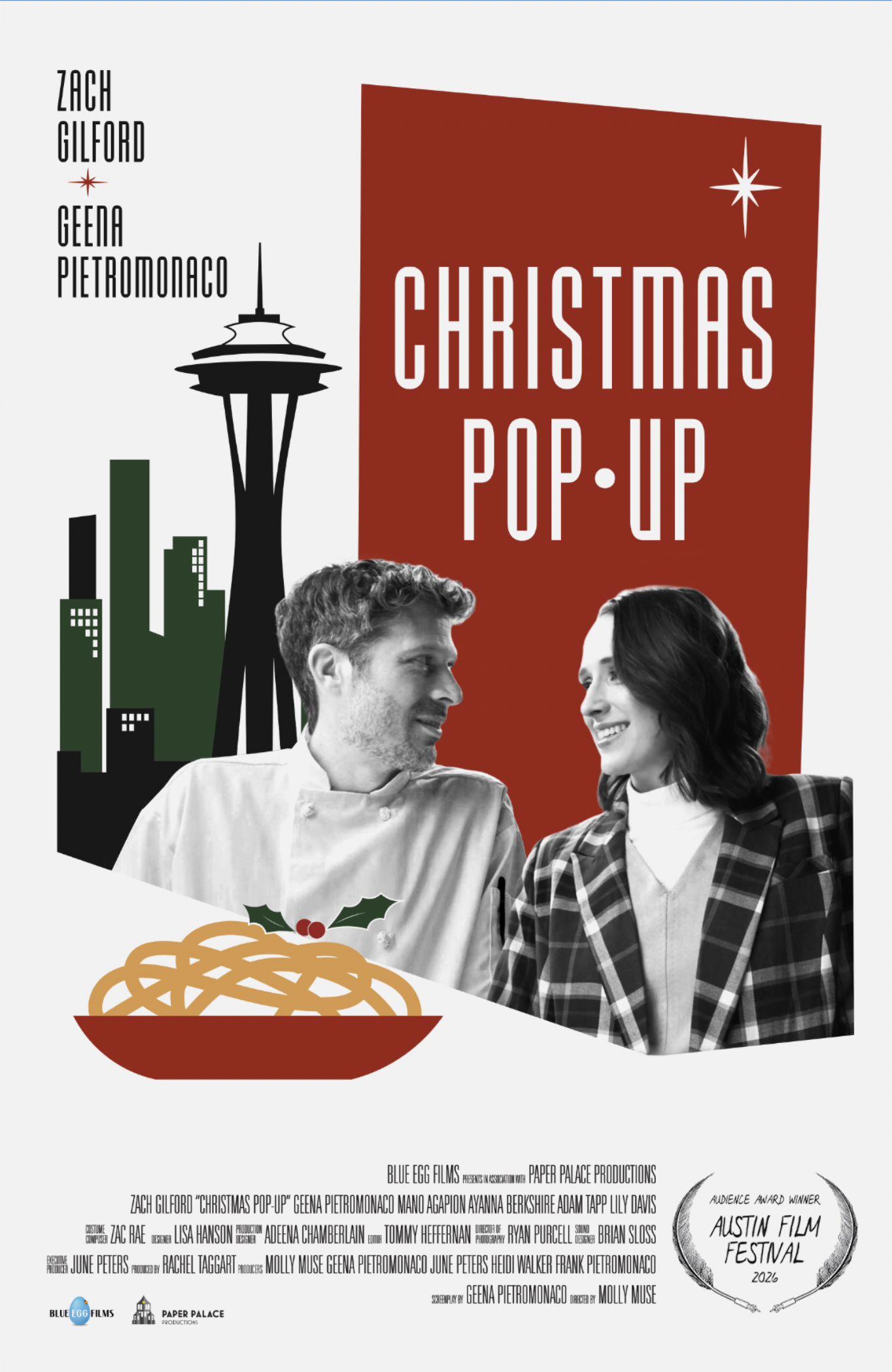
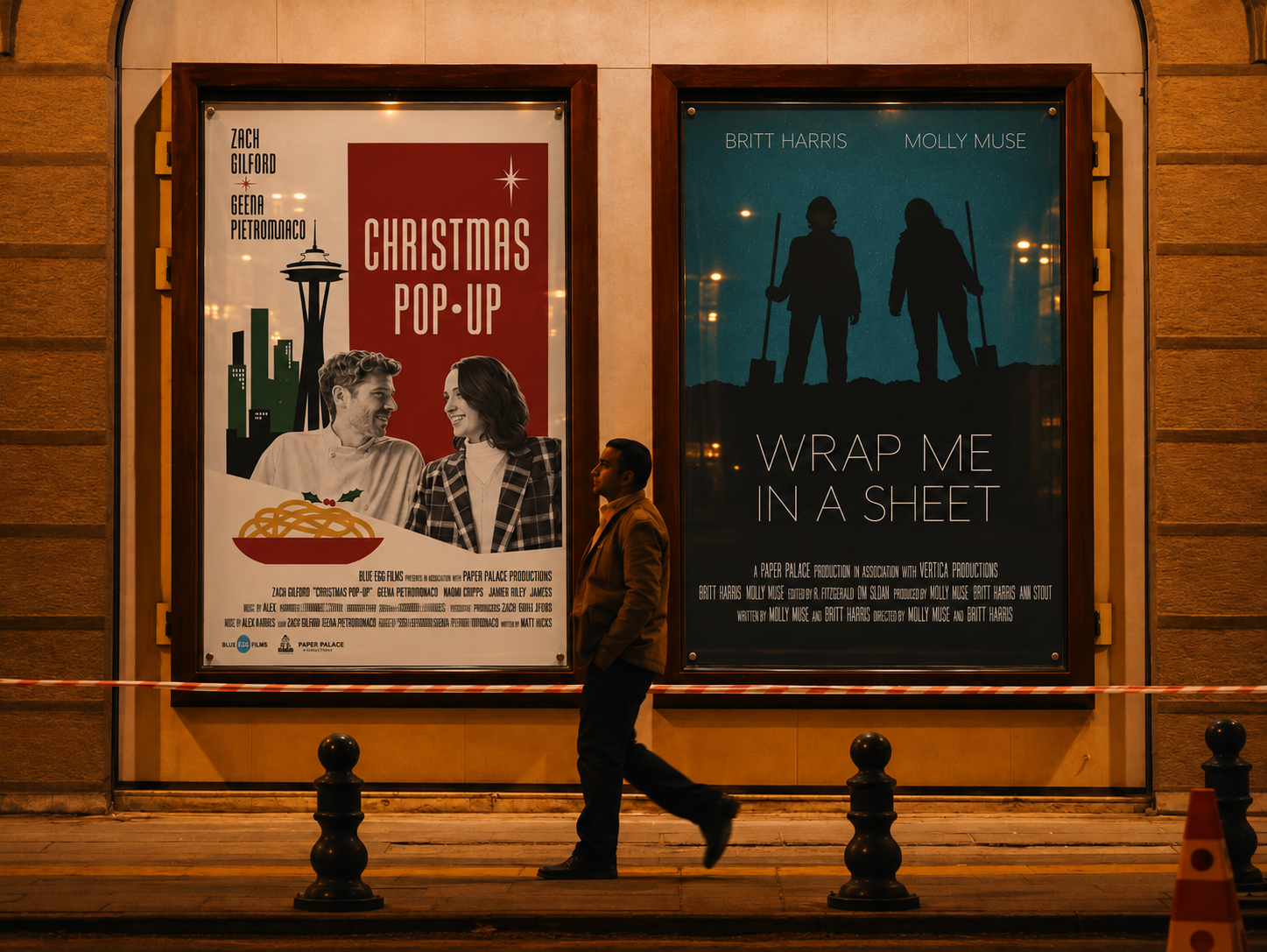
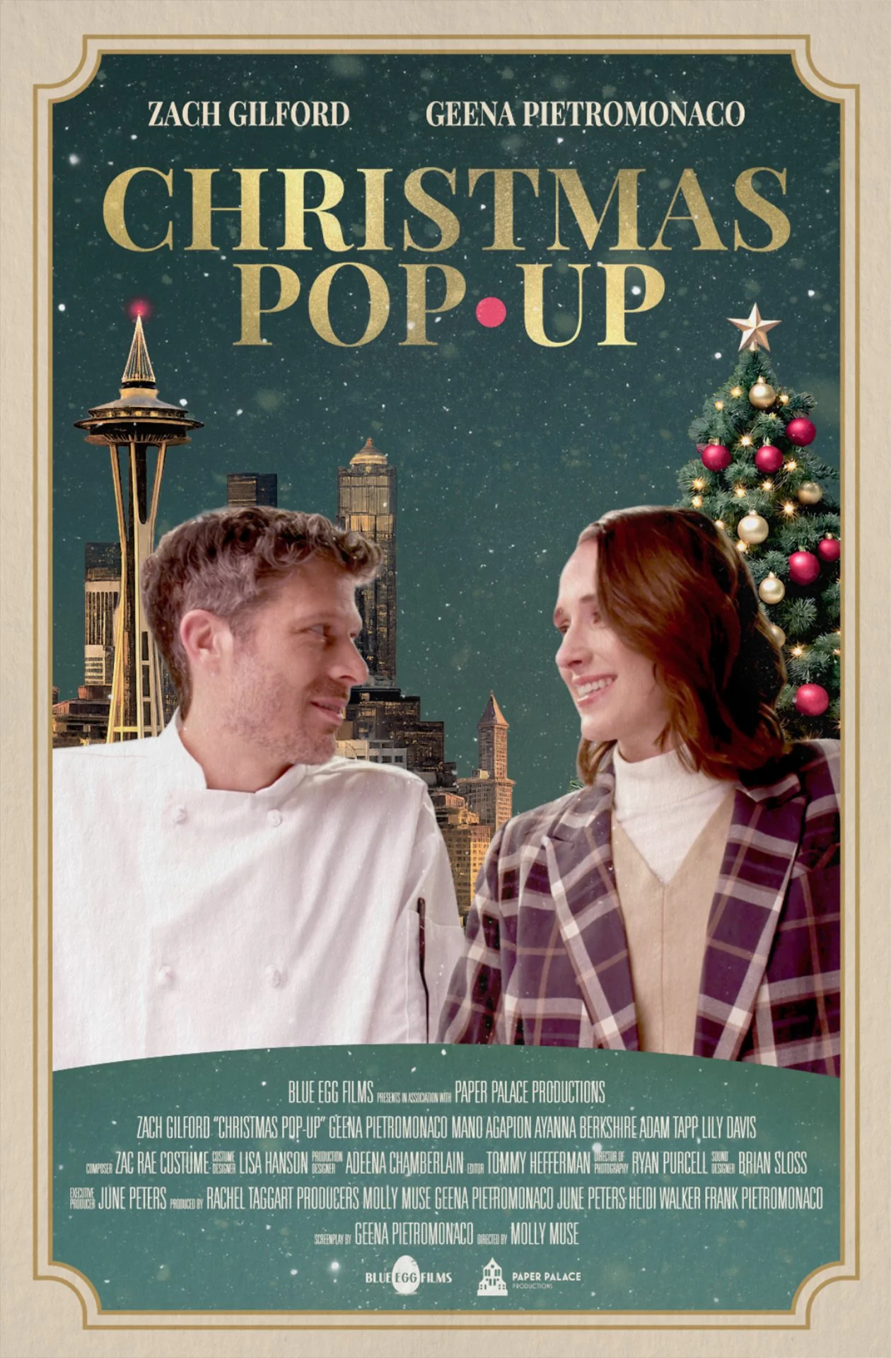
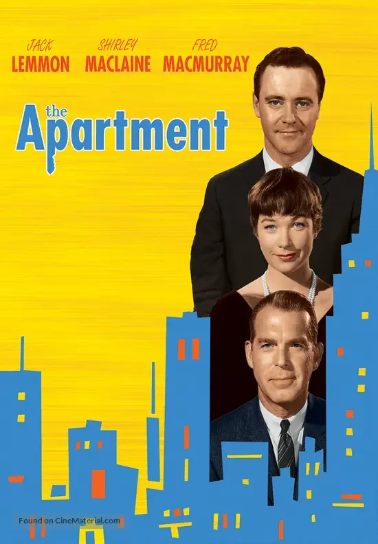
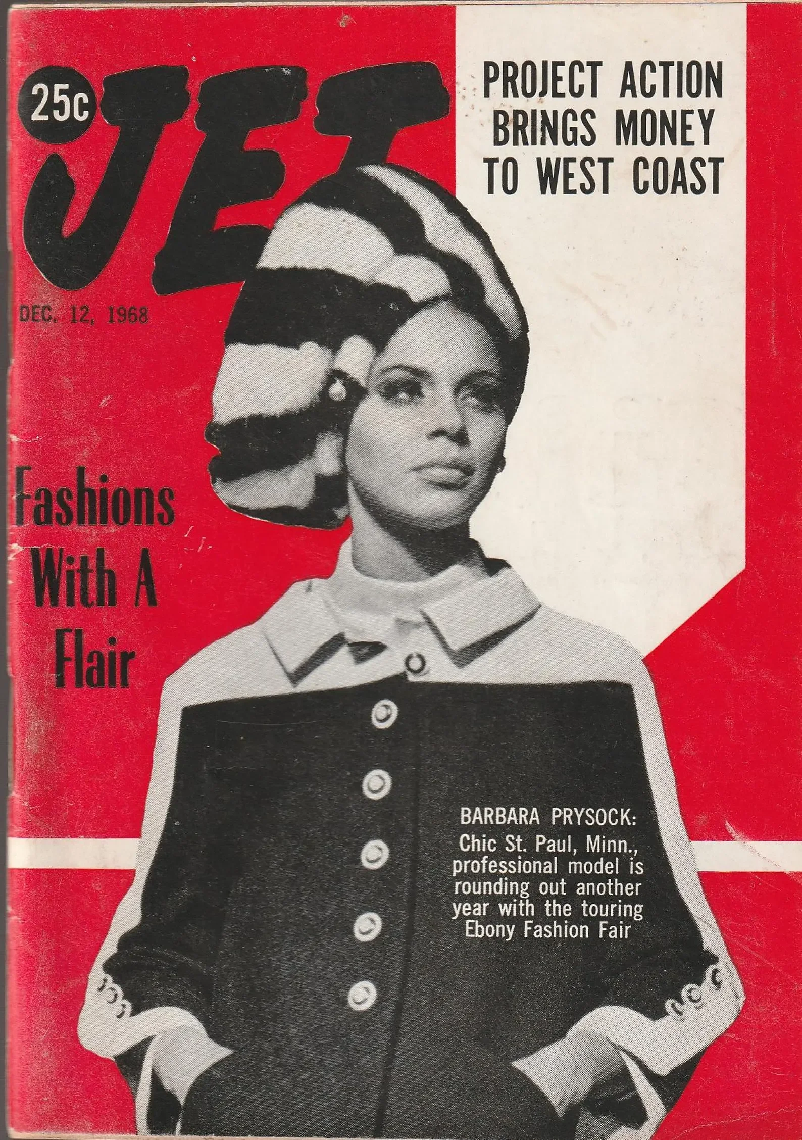
During early ideation, I pitched a bold, Mid-Century Modern direction alongside a more conventional, commercial-facing holiday poster. The producers initially chose the safer commercial route for early distribution sales. However, after the film failed to sell in that crowded market, the team pivoted back to my original Mid-Century Modern concept to lead their festival campaign—a strategic shift that helped Christmas Pop-Up stand out on the circuit and win the Audience Choice Award at the Austin Film Festival.
Drawing from 1960s theatrical posters and Mid-Century Modern print craft, the design language strips away modern holiday clutter in favor of bold graphic restraint. High-contrast monochromatic portraiture sits against an asymmetrical crimson block, anchored by atomic starbursts, flat vector silhouettes of Seattle’s Space Needle and a holly-topped bowl of pasta, and generous off-white negative space. Tall, condensed display lettering establishes classic theatrical authority while keeping the hierarchy crisp, balanced, and unmistakably timeless.
03 / Further Scope
WIDER STUDIO DELIVERABLES
Animated Studio Ident (After Effects)